Code
library(tidyverse)
library(broom)
library(patchwork)
library(scales)
library(ggdag)In the example guide for generating random numbers, we explored how to use a bunch of different statistical distributions to create variables that had reasonable values. However, each of the columns that we generated there were completely independent of each other. In the final example, we made some data with columns like age, education, and income, but none of those were related, though in real life they would be.
Generating random variables is fairly easy: choose some sort of distributional shape, set parameters like a mean and standard deviation, and let randomness take over. Forcing variables to be related is a little trickier and involves a little math. But don’t worry! That math is all just regression stuff!
library(tidyverse)
library(broom)
library(patchwork)
library(scales)
library(ggdag)Let’s pretend we want to predict someone’s happiness on a 10-point scale based on the number of cookies they’ve eaten and whether or not their favorite color is blue.
\[ \text{Happiness} = \beta_0 + \beta_1 \text{Cookies eaten} + \beta_2 \text{Favorite color is blue} + \varepsilon \]
We can generate a fake dataset with columns for happiness (Beta distribution clustered around 7ish), cookies (Poisson distribution), and favorite color (binomial distribution for blue/not blue):
set.seed(1234)

n_people <- 1000
happiness_simple <- tibble(
  id = 1:n_people,
  happiness = rbeta(n_people, shape1 = 7, shape2 = 3),
  cookies = rpois(n_people, lambda = 1),
  color_blue = sample(c("Blue", "Not blue"), n_people, replace = TRUE)
) |>
  # Adjust some of the columns
  mutate(happiness = round(happiness * 10, 1),
         cookies = cookies + 1,
         color_blue = fct_relevel(factor(color_blue), "Not blue"))

head(happiness_simple)
## # A tibble: 6 × 4
##      id happiness cookies color_blue
##   <int>     <dbl>   <dbl> <fct>
## 1     1       8.7       2 Blue
## 2     2       6.5       2 Not blue
## 3     3       4.8       2 Blue
## 4     4       9.6       3 Not blue
## 5     5       6.2       1 Not blue
## 6     6       6.1       2 Blue
We have a neat dataset now, so let’s run a regression. Is eating more cookies or liking blue associated with greater happiness?
model_happiness1 <- lm(happiness ~ cookies + color_blue, data = happiness_simple)
tidy(model_happiness1)
## # A tibble: 3 × 5
##   term           estimate std.error statistic p.value
##   <chr>             <dbl>     <dbl>     <dbl>   <dbl>
## 1 (Intercept)     7.06       0.105     67.0     0
## 2 cookies        -0.00884    0.0419    -0.211   0.833
## 3 color_blueBlue -0.0202     0.0861    -0.235   0.815
Not really. The coefficients for both cookies and color_blueBlue are basically 0 and not statistically significant. That makes sense since the three columns are completely independent of each other. If there were any significant effects, that’d be strange and solely because of random chance.
For the sake of your final project, you can just leave all the columns completely independent of each other if you want. None of your results will be significant and you won’t see any effects anywhere, but you can still build models, run all the pre-model diagnostics, and create graphs and tables based on this data.
HOWEVER, it will be far more useful to you if you generate relationships. The whole goal of this class is to find causal effects in observational, non-experimental data. If you can generate synthetic non-experimental data and bake in a known causal effect, you can know if your different methods for recovering that effect are working.
So how do we bake in correlations and causal effects?
To help with the intuition of how to link these columns, think about the model we’re building:
\[ \text{Happiness} = \beta_0 + \beta_1 \text{Cookies eaten} + \beta_2 \text{Favorite color is blue} + \varepsilon \]
This model provides estimates for all those betas. Throughout the semester, we’ve used the analogy of sliders and switches to describe regression coefficients. Here we have both:
We can invent our own coefficients and use some math to build them into the dataset. Let’s use these numbers as our targets:
When generating the data, we can’t just use rbeta() by itself to generate happiness, since happiness depends on both cookies and favorite color (that’s why we call it a dependent variable). To build in this effect, we can add a new column that uses math and modifies the underlying rbeta()-based happiness score:
happiness_with_effect <- happiness_simple |>
  # Turn the categorical favorite color column into TRUE/FALSE so we can do math with it
  mutate(color_blue_binary = ifelse(color_blue == "Blue", TRUE, FALSE)) |>
  # Make a new happiness column that uses coefficients for cookies and favorite color
  mutate(happiness_modified = happiness + (0.25 * cookies) + (0.75 * color_blue_binary))
head(happiness_with_effect)
## # A tibble: 6 × 6
##      id happiness cookies color_blue color_blue_binary happiness_modified
##   <int>     <dbl>   <dbl> <fct>      <lgl>                          <dbl>
## 1     1       8.7       2 Blue       TRUE                            9.95
## 2     2       6.5       2 Not blue   FALSE                           7
## 3     3       4.8       2 Blue       TRUE                            6.05
## 4     4       9.6       3 Not blue   FALSE                          10.4
## 5     5       6.2       1 Not blue   FALSE                           6.45
## 6     6       6.1       2 Blue       TRUE                            7.35
Now that we have a new happiness_modified column we can run a model using it as the outcome:
model_happiness2 <- lm(happiness_modified ~ cookies + color_blue, data = happiness_with_effect)
tidy(model_happiness2)
## # A tibble: 3 × 5
##   term           estimate std.error statistic  p.value
##   <chr>             <dbl>     <dbl>     <dbl>    <dbl>
## 1 (Intercept)       7.06     0.105      67.0  0
## 2 cookies           0.241    0.0419      5.76 1.13e- 8
## 3 color_blueBlue    0.730    0.0861      8.48 8.25e-17
Whoa! Look at those coefficients! They’re exactly what we tried to build in! The baseline happiness (intercept) is ≈7, eating one cookie is associated with a ≈0.25 increase in happiness, and liking blue is associated with a ≈0.75 increase in happiness.
However, we originally said that happiness was a 0-10 point scale. After boosting it with extra happiness for cookies and liking blue, there are some people who score higher than 10:
# Original scale
ggplot(happiness_with_effect, aes(x = happiness)) +
  geom_histogram(binwidth = 1, color = "white") +
  scale_x_continuous(breaks = 0:11) +
  coord_cartesian(xlim = c(0, 11))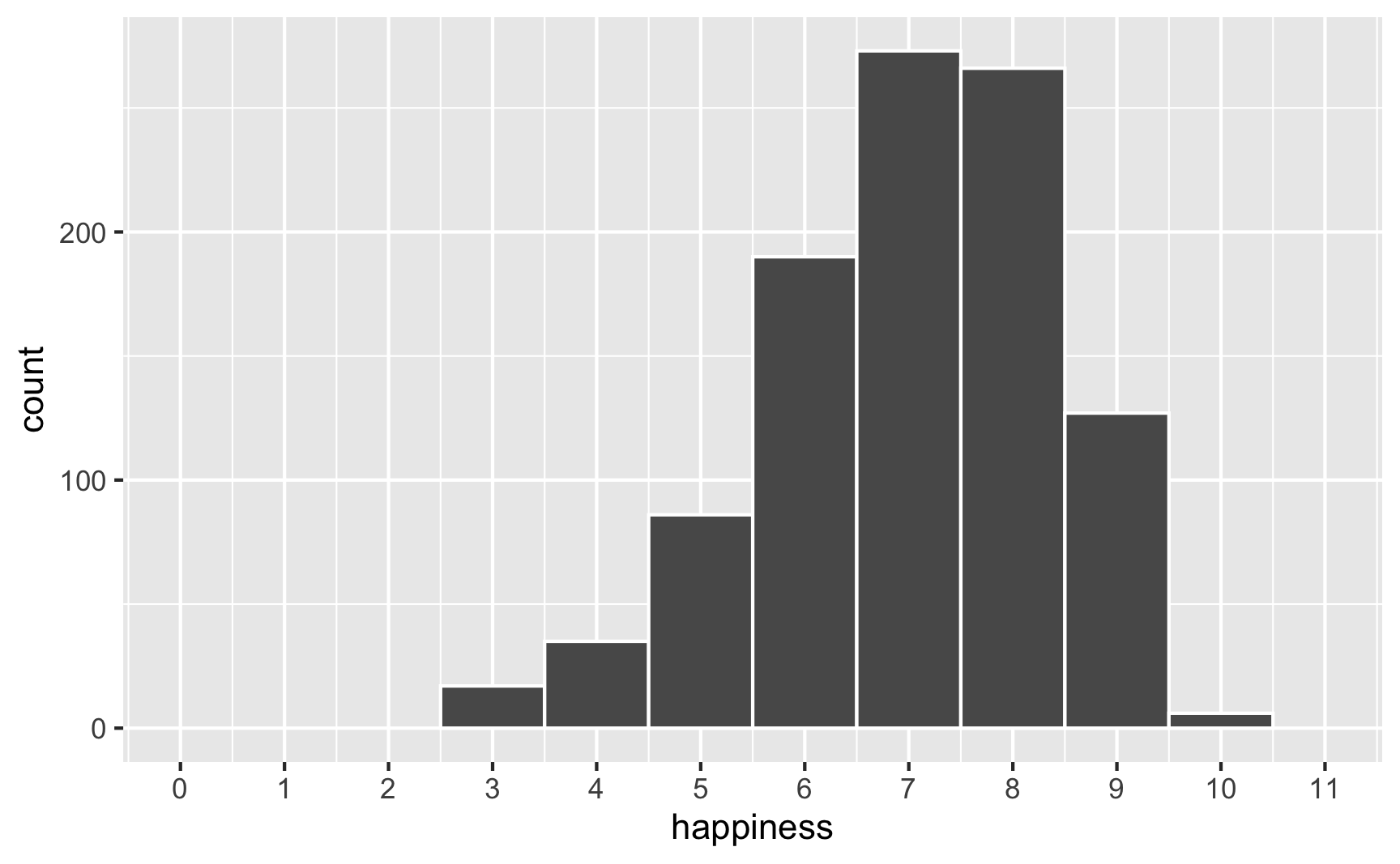
# Scaled up
ggplot(happiness_with_effect, aes(x = happiness_modified)) +
  geom_histogram(binwidth = 1, color = "white") +
  scale_x_continuous(breaks = 0:11) +
  coord_cartesian(xlim = c(0, 11))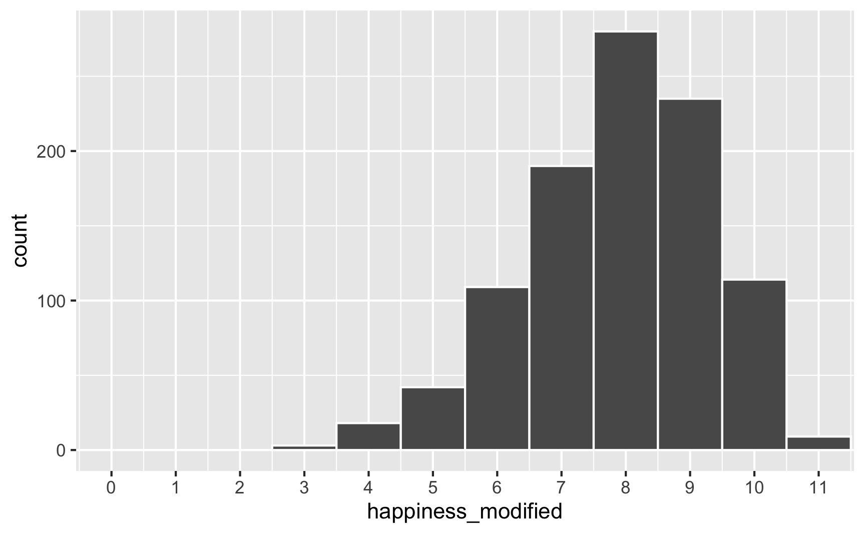
To fix that, we can use the rescale() function from the {scales} package to force the new happiness_modified variable to fit back in its original range:
happiness_with_effect <- happiness_with_effect |>
  mutate(happiness_rescaled = rescale(happiness_modified, to = c(3, 10)))

ggplot(happiness_with_effect, aes(x = happiness_rescaled)) +
  geom_histogram(binwidth = 1, color = "white") +
  scale_x_continuous(breaks = 0:11) +
  coord_cartesian(xlim = c(0, 11))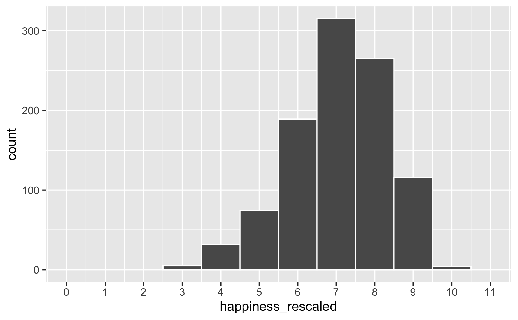
Everything is back in the 3–10 range now. However, the rescaling also rescaled our built-in effects. Look what happens if we use the happiness_rescaled in the model:
model_happiness3 <- lm(happiness_rescaled ~ cookies + color_blue, data = happiness_with_effect)
tidy(model_happiness3)
## # A tibble: 3 × 5
##   term           estimate std.error statistic  p.value
##   <chr>             <dbl>     <dbl>     <dbl>    <dbl>
## 1 (Intercept)       6.34     0.0910     69.6  0
## 2 cookies           0.208    0.0362      5.76 1.13e- 8
## 3 color_blueBlue    0.631    0.0744      8.48 8.25e-17
Now the baseline happiness is 6.3, the cookies effect is 0.2, and the blue effect is 0.63. These effects shrunk because we shrunk the data back down to have a maximum of 10.
There are probably fancy mathy ways to rescale data and keep the coefficients the same size, but rather than figure that out (who even wants to do that?!), my strategy is just to play with numbers until the results look good. Instead of using a 0.25 cookie effect and 0.75 blue effect, I make those effects bigger so that the rescaled version is roughly what I really want. There’s no systematic way to do this—I ran this chunk below a bunch of times until the numbers worked.
set.seed(1234)

n_people <- 1000
happiness_real_effect <- tibble(
  id = 1:n_people,
  happiness_baseline = rbeta(n_people, shape1 = 7, shape2 = 3),
  cookies = rpois(n_people, lambda = 1),
  color_blue = sample(c("Blue", "Not blue"), n_people, replace = TRUE)
) |>
  # Adjust some of the columns
  mutate(happiness_baseline = round(happiness_baseline * 10, 1),
         cookies = cookies + 1,
         color_blue = fct_relevel(factor(color_blue), "Not blue")) |>
  # Turn the categorical favorite color column into TRUE/FALSE so we can do math with it
  mutate(color_blue_binary = ifelse(color_blue == "Blue", TRUE, FALSE)) |>
  # Make a new happiness column that uses coefficients for cookies and favorite color
  mutate(happiness_effect = happiness_baseline +
           (0.31 * cookies) +  # Cookie effect
           (0.91 * color_blue_binary)) |>  # Blue effect
  # Rescale to 3-10, since that's what the original happiness column looked like
  mutate(happiness = rescale(happiness_effect, to = c(3, 10)))

model_does_this_work_yet <- lm(happiness ~ cookies + color_blue, data = happiness_real_effect)
tidy(model_does_this_work_yet)
## # A tibble: 3 × 5
##   term           estimate std.error statistic  p.value
##   <chr>             <dbl>     <dbl>     <dbl>    <dbl>
## 1 (Intercept)       6.15     0.0886     69.4  0
## 2 cookies           0.253    0.0352      7.19 1.25e-12
## 3 color_blueBlue    0.749    0.0724     10.3  7.44e-24
There’s nothing magical about the 0.31 and 0.91 numbers I used here; I just kept changing those to different things until the regression coefficients ended up at ≈0.25 and ≈0.75. Also, I gave up on trying to make the baseline happiness 7. It’s possible to do—you’d just need to also shift the underlying Beta distribution up (like shape1 = 9, shape2 = 2 or something). But then you’d also need to change the coefficients more. You’ll end up with 3 moving parts and it can get complicated, so I don’t worry too much about it, since what we care about the most here is the effect of cookies and favorite color, not baseline levels of happiness.
Phew. We successfully connected cookies and favorite color to happiness and we have effects that are measurable with regression! One last thing that I would do is get rid of some of the intermediate columns like color_blue_binary or happiness_effect—we only used those for the behind-the-scenes math of creating the effect. Here’s our final synthetic dataset:
happiness <- happiness_real_effect |>
  select(id, happiness, cookies, color_blue)
head(happiness)
## # A tibble: 6 × 4
##      id happiness cookies color_blue
##   <int>     <dbl>   <dbl> <fct>
## 1     1      8.81       2 Blue
## 2     2      6.20       2 Not blue
## 3     3      5.53       2 Blue
## 4     4      9.07       3 Not blue
## 5     5      5.68       1 Not blue
## 6     6      6.63       2 Blue
We can save that as a CSV file with write_csv():
write_csv(happiness, "data/happiness_fake_data.csv")In that cookie example, we assumed that both cookie consumption and favorite color are associated with happiness. We also assumed that cookie consumption and favorite color are not related to each other. But what if they are? What if people who like blue eat more cookies?
We’ve already used regression-based math to connect explanatory variables to outcome variables. We can use that same intuition to connect explanatory variables to each other.
The easiest way to think about this is with DAGs. Here’s the DAG for the model we just ran:
happiness_dag1 <- dagify(hap ~ cook + blue,
                         coords = list(x = c(hap = 3, cook = 1, blue = 2),
                                       y = c(hap = 1, cook = 1, blue = 2)))

ggdag(happiness_dag1) +
  theme_dag()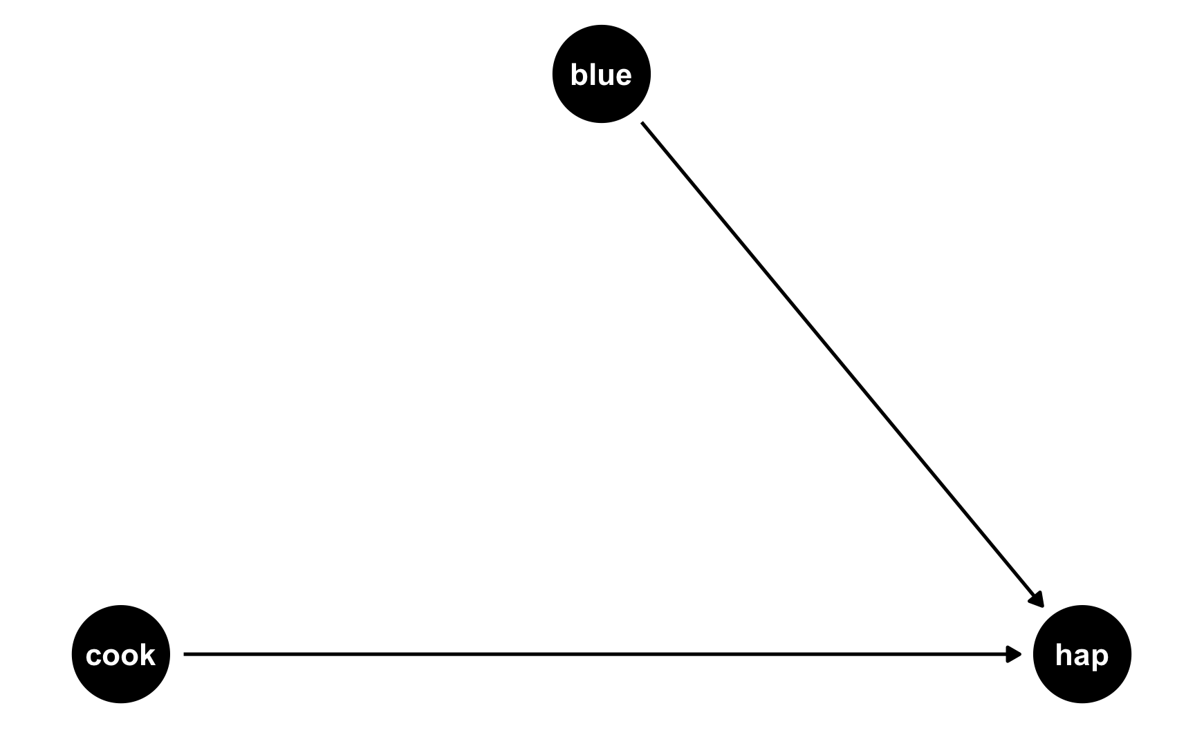
Both cookies and favorite color cause happiness, but there’s no link between them. Notice that dagify() uses the same model syntax that lm() does: hap ~ cook + blue. If we think of this just like a regression model, we can pretend that there are coefficients there too: hap ~ 0.25*cook + 0.75*blue. We don’t actually include any coefficients in the DAG or anything, but it helps with the intuition.
But what if people who like blue eat more cookies on average? For whatever reason, let’s pretend that liking blue causes you to eat 0.5 more cookies, on average. Here’s the new DAG:
happiness_dag2 <- dagify(hap ~ cook + blue,
                         cook ~ blue,
                         coords = list(x = c(hap = 3, cook = 1, blue = 2),
                                       y = c(hap = 1, cook = 1, blue = 2)))

ggdag(happiness_dag2) +
  theme_dag()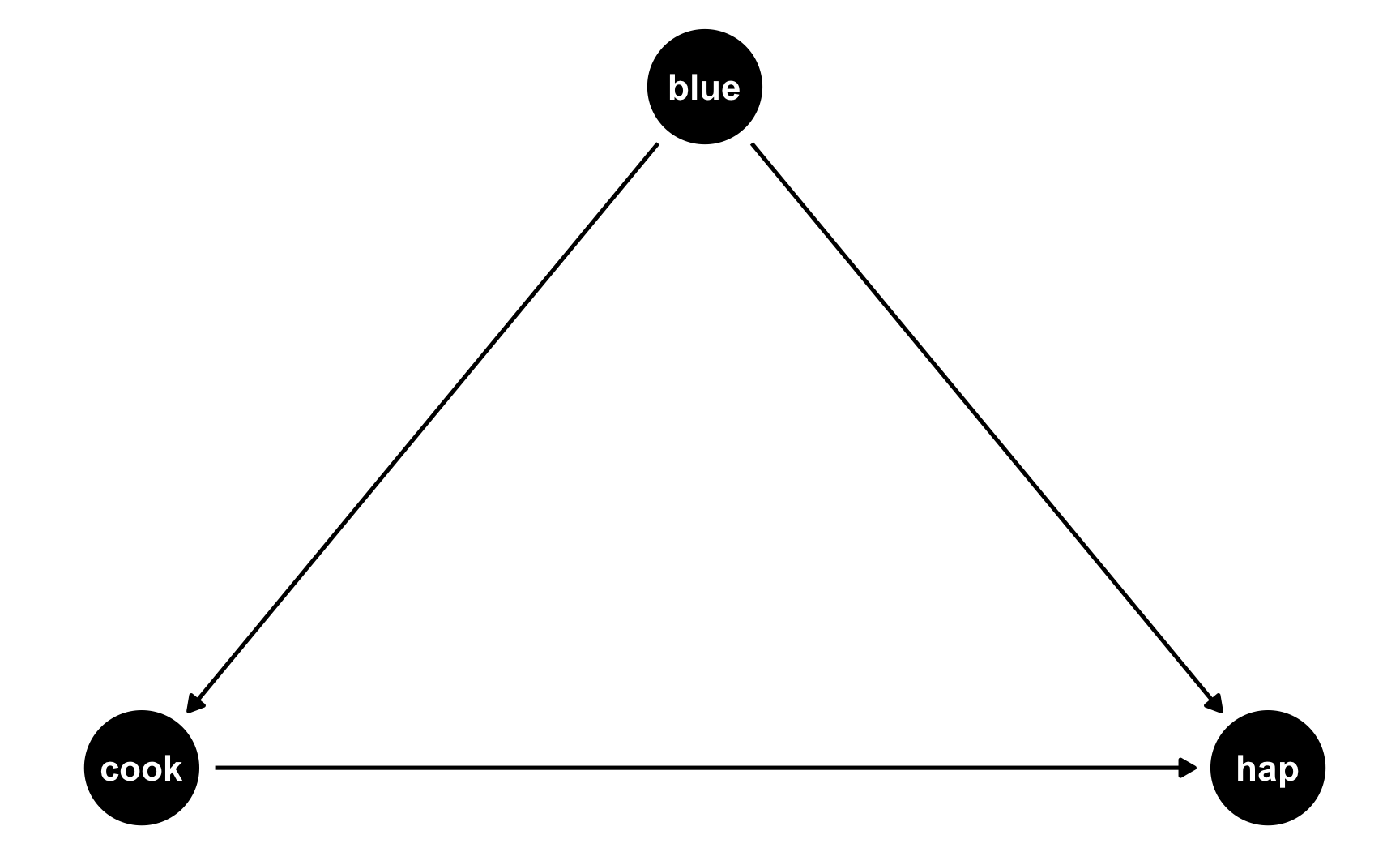
Now we have two different equations: hap ~ cook + blue and cook ~ blue. Conveniently, these both translate to models, and we know the coefficients we want!
hap ~ 0.25*cook + 0.75*blue: This is what we built before—cookies boost happiness by 0.25 and liking blue boosts happiness by 0.75cook ~ 0.3*blue: This is what we just proposed—liking blue boosts cookies by 0.5We can follow the same process we did when building the cookie and blue effects into happiness to also build a blue effect into cookies!
set.seed(1234)

n_people <- 1000
happiness_cookies_blue <- tibble(
  id = 1:n_people,
  happiness_baseline = rbeta(n_people, shape1 = 7, shape2 = 3),
  cookies = rpois(n_people, lambda = 1),
  color_blue = sample(c("Blue", "Not blue"), n_people, replace = TRUE)
) |>
  # Adjust some of the columns
  mutate(happiness_baseline = round(happiness_baseline * 10, 1),
         cookies = cookies + 1,
         color_blue = fct_relevel(factor(color_blue), "Not blue")) |>
  # Turn the categorical favorite color column into TRUE/FALSE so we can do math with it
  mutate(color_blue_binary = ifelse(color_blue == "Blue", TRUE, FALSE)) |>
  # Make blue have an effect on cookie consumption
  mutate(cookies = cookies + (0.5 * color_blue_binary)) |>
  # Make a new happiness column that uses coefficients for cookies and favorite color
  mutate(happiness_effect = happiness_baseline +
           (0.31 * cookies) +  # Cookie effect
           (0.91 * color_blue_binary)) |>  # Blue effect
  # Rescale to 3-10, since that's what the original happiness column looked like
  mutate(happiness = rescale(happiness_effect, to = c(3, 10)))
head(happiness_cookies_blue)
## # A tibble: 6 × 7
##      id happiness_baseline cookies color_blue color_blue_binary happiness_effect happiness
##   <int>              <dbl>   <dbl> <fct>      <lgl>                        <dbl>     <dbl>
## 1     1                8.7     2.5 Blue       TRUE                         10.4       8.84
## 2     2                6.5     2   Not blue   FALSE                         7.12      6.14
## 3     3                4.8     2.5 Blue       TRUE                          6.48      5.61
## 4     4                9.6     3   Not blue   FALSE                        10.5       8.96
## 5     5                6.2     1   Not blue   FALSE                         6.51      5.63
## 6     6                6.1     2.5 Blue       TRUE                          7.78      6.69
Notice now that people who like blue eat partial cookies, as expected. We can verify that there’s a relationship between liking blue and cookies by running a model:
lm(cookies ~ color_blue, data = happiness_cookies_blue) |>
  tidy()
## # A tibble: 2 × 5
##   term           estimate std.error statistic   p.value
##   <chr>             <dbl>     <dbl>     <dbl>     <dbl>
## 1 (Intercept)       2.07     0.0451     45.9  3.51e-248
## 2 color_blueBlue    0.460    0.0651      7.07 2.96e- 12
Yep. Liking blue is associated with 0.46 more cookies on average (it’s not quite 0.5, but that’s because of randomness).
Now let’s do some neat DAG magic. Let’s say we’re interested in the causal effect of cookies on happiness. We could run a naive model:
model_happiness_naive <- lm(happiness ~ cookies, data = happiness_cookies_blue)
tidy(model_happiness_naive)
## # A tibble: 2 × 5
##   term        estimate std.error statistic  p.value
##   <chr>          <dbl>     <dbl>     <dbl>    <dbl>
## 1 (Intercept)    6.27     0.0894     70.1  0
## 2 cookies        0.325    0.0354      9.18 2.40e-19
Based on this, eating a cookie causes you to have 0.325 more happiness points. But that’s wrong! Liking the color blue is a confounder and opens a path between cookies and happiness. You can see the confounding both in the DAG (since blue points to both the cookie node and the happiness node) and in the math (liking blue boosts happiness + liking blue boosts cookie consumption, which boosts happiness).
To fix this confounding, we need to statistically adjust for liking blue and close the backdoor path. Ordinarily we’d do this with something like matching or inverse probability weighting, but here we can just include liking blue as a control variable (since it’s linearly related to both cookies and happiness):
model_happiness_ate <- lm(happiness ~ cookies + color_blue, data = happiness_cookies_blue)
tidy(model_happiness_ate)
## # A tibble: 3 × 5
##   term           estimate std.error statistic  p.value
##   <chr>             <dbl>     <dbl>     <dbl>    <dbl>
## 1 (Intercept)       6.09     0.0870     70.0  0
## 2 cookies           0.249    0.0346      7.19 1.25e-12
## 3 color_blueBlue    0.739    0.0729     10.1  4.70e-23
After adjusting for backdoor confounding, eating one additional cookie causes a 0.249 point increase in happiness. This is the effect we originally built into the data!
If you wanted, we could rescale the number of cookies just like we rescaled happiness before, since sometimes adding effects to columns changes their reasonable ranges.
Now that we have a good working dataset, we can keep the columns we care about and save it as a CSV file for later use:
happiness <- happiness_cookies_blue |>
  select(id, happiness, cookies, color_blue)
head(happiness)
## # A tibble: 6 × 4
##      id happiness cookies color_blue
##   <int>     <dbl>   <dbl> <fct>
## 1     1      8.84     2.5 Blue
## 2     2      6.14     2   Not blue
## 3     3      5.61     2.5 Blue
## 4     4      8.96     3   Not blue
## 5     5      5.63     1   Not blue
## 6 6 6.69 2.5 Bluewrite_csv(happiness, "data/happiness_fake_data.csv")We’ve got columns that follow specific distributions, and we’ve got columns that are statistically related to each other. We can add one more wrinkle to make our fake data even more fun (and even more reflective of real life). We can add some noise.
Right now, the effects we’re finding are too perfect. When we used mutate() to add a 0.25 boost in happiness for every cookie people ate, we added exactly 0.25 happiness points. If someone ate 2 cookies, they got 0.5 more happiness; if they ate 5, they got 1.25 more.
What if the cookie effect isn’t exactly 0.25, but somewhere around 0.25? For some people it’s 0.1, for others it’s 0.3, for others it’s 0.22. We can use the same ideas we talked about in the random numbers example to generate a distribution of an effect. For instance, let’s say that the average cookie effect is 0.25, but it can vary somewhat with a standard deviation of 0.15:
temp_data <- tibble(x = rnorm(10000, mean = 0.25, sd = 0.15))

ggplot(temp_data, aes(x = x)) +
  geom_histogram(binwidth = 0.05, boundary = 0, color = "white")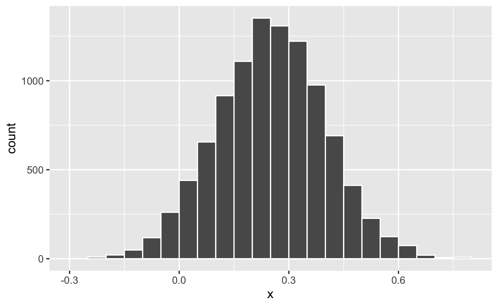
Sometimes it can go as low as −0.25; sometimes it can go as high as 0.75; normally it’s around 0.25.
Nothing in the model explains why it’s higher or lower for some people—it’s just random noise. Remember that the model accounts for that! This random variation is what the \(\varepsilon\) is for in this model equation:
\[ \text{Happiness} = \beta_0 + \beta_1 \text{Cookies eaten} + \beta_2 \text{Favorite color is blue} + \varepsilon \]
We can build that uncertainty into the fake column! Instead of using 0.31 * cookies when generating happiness (which is technically 0.25, but shifted up to account for rescaling happiness back down after), we’ll make a column for the cookie effect and then multiply that by the number of cookies.
set.seed(1234)

n_people <- 1000
happiness_cookies_noisier <- tibble(
  id = 1:n_people,
  happiness_baseline = rbeta(n_people, shape1 = 7, shape2 = 3),
  cookies = rpois(n_people, lambda = 1),
  cookie_effect = rnorm(n_people, mean = 0.31, sd = 0.2),
  color_blue = sample(c("Blue", "Not blue"), n_people, replace = TRUE)
) |>
  # Adjust some of the columns
  mutate(happiness_baseline = round(happiness_baseline * 10, 1),
         cookies = cookies + 1,
         color_blue = fct_relevel(factor(color_blue), "Not blue")) |>
  # Turn the categorical favorite color column into TRUE/FALSE so we can do math with it
  mutate(color_blue_binary = ifelse(color_blue == "Blue", TRUE, FALSE)) |>
  # Make blue have an effect on cookie consumption
  mutate(cookies = cookies + (0.5 * color_blue_binary)) |>
  # Make a new happiness column that uses coefficients for cookies and favorite
  # color. Importantly, instead of using 0.31 * cookies, we'll use the random
  # cookie effect we generated earlier
  mutate(happiness_effect = happiness_baseline +
           (cookie_effect * cookies) +
           (0.91 * color_blue_binary)) |>
  # Rescale to 3-10, since that's what the original happiness column looked like
  mutate(happiness = rescale(happiness_effect, to = c(3, 10)))
head(happiness_cookies_noisier)
## # A tibble: 6 × 8
##      id happiness_baseline cookies cookie_effect color_blue color_blue_binary happiness_effect happiness
##   <int>              <dbl>   <dbl>         <dbl> <fct>      <lgl>                        <dbl>     <dbl>
## 1     1                8.7     2.5        0.124  Blue       TRUE                          9.92      8.16
## 2     2                6.5     2.5        0.370  Blue       TRUE                          8.34      7.02
## 3     3                4.8     2.5        0.326  Blue       TRUE                          6.53      5.72
## 4     4                9.6     3.5        0.559  Blue       TRUE                         12.5       9.98
## 5     5                6.2     1.5        0.0631 Blue       TRUE                          7.20      6.21
## 6     6                6.1     2          0.222  Not blue   FALSE                         6.54      5.73
Now let’s look at the cookie effect in this noisier data:
model_noisier <- lm(happiness ~ cookies + color_blue, data = happiness_cookies_noisier)
tidy(model_noisier)
## # A tibble: 3 × 5
##   term           estimate std.error statistic  p.value
##   <chr>             <dbl>     <dbl>     <dbl>    <dbl>
## 1 (Intercept)       6.11     0.0779     78.4  0
## 2 cookies           0.213    0.0314      6.79 1.92e-11
## 3 color_blueBlue    0.650    0.0671      9.68 3.01e-21
The effect is a little smaller now because of the extra noise, so we’d need to mess with the 0.31 and 0.91 coefficients more to get those numbers back up to 0.25 and 0.75.
While this didn’t influence the findings too much here, it can have consequences for other variables. For instance, in the previous section we said that the color blue influences cookie consumption. If the blue effect on cookies isn’t precisely 0.5 but follows some sort of distribution (sometimes small, sometimes big, sometimes negative, sometimes zero), that will influence cookies differently. That random effect on cookie consumption will then work together with the random effect of cookies on happiness, resulting in multiple varied values.
For instance, imagine the average effect of liking blue on cookies is 0.5, and the average effect of cookies on happiness is 0.25. For one person, their blue-on-cookie effect might be 0.392, which changes the number of cookies they eat. Their cookie-on-happiness effect is 0.573, which changes their happiness. Both of those random effects work together to generate the final happiness.
If you want more realistic-looking synthetic data, it’s a good idea to add some random noise wherever you can.
Going through this process requires a ton of trial and error. You will change all sorts of numbers to make sure the relationships you’re building work. This is especially the case if you rescale things, since that rescales your effects. There are a lot of moving parts and this is a complicated process.
You’ll run your data generation chunks lots and lots and lots of times, tinkering with the numbers as you go. This example makes it look easy, since it’s the final product, but I ran all these chunks over and over again until I got the causal effect and relationships just right.
It’s best if you also create plots and models to see what the relationships look like
We covered a bunch of distributions in the random number generation example, but it’s hard to think about what a standard deviation of 2 vs 10 looks like, or what happens when you mess with the shape parameters in a Beta distribution.
It’s best to visualize these variables. You could build the variable into your official dataset and then look at it, but I find it’s often faster to just look at what a general distribution looks like first. The easiest way to do this is generate a dataset with just one column in it and look at it, either with a histogram or a density plot.
For instance, what does a Beta distribution with shape1 = 3 and shape2 = 16 look like? The math says it should peak around 0.15ish (\(\frac{3}{3 + 16}\)), and that looks like the case:
temp_data <- tibble(x = rbeta(10000, shape1 = 3, shape2 = 16))

plot1 <- ggplot(temp_data, aes(x = x)) +
  geom_histogram(binwidth = 0.05, boundary = 0, color = "white")

plot2 <- ggplot(temp_data, aes(x = x)) +
  geom_density()

plot1 + plot2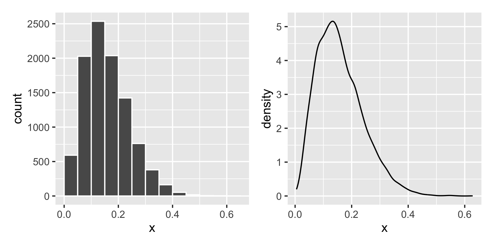
What if we want a normal distribution centered around 100, with most values range from 50 to 150. That’s range of ±50, but that doesn’t mean the sd will be 50—it’ll be much smaller than that, like 25ish. Tinker with the numbers until it looks right.
temp_data <- tibble(x = rnorm(10000, mean = 100, sd = 25))

plot1 <- ggplot(temp_data, aes(x = x)) +
  geom_histogram(binwidth = 10, boundary = 0, color = "white")

plot2 <- ggplot(temp_data, aes(x = x)) +
  geom_density()

plot1 + plot2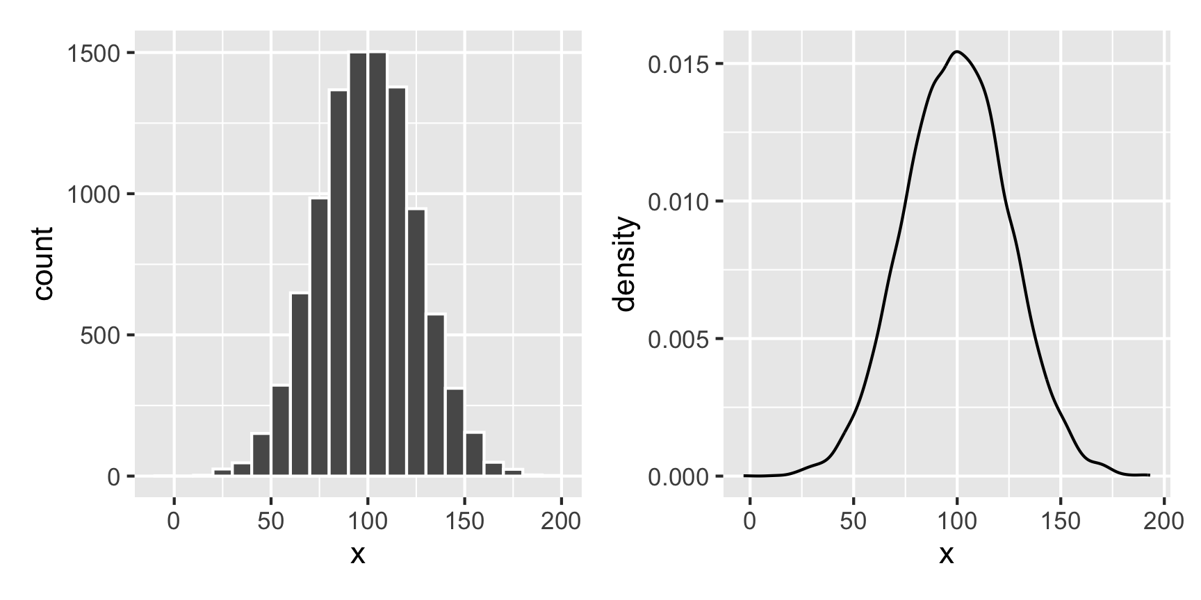
If you have two continuous/numeric columns, it’s best to use a scatterplot. For instance, let’s make two columns based on the Beta and normal distributions above, and we’ll make it so that y goes up by 0.25 for every increase in x, along with some noise:
set.seed(1234)

temp_data <- tibble(
  x = rnorm(1000, mean = 100, sd = 25)
) |>
  mutate(y = rbeta(1000, shape1 = 3, shape2 = 16) +  # Baseline distribution
           (0.25 * x) +  # Effect of x
           rnorm(1000, mean = 0, sd = 10))  # Add some noise

ggplot(temp_data, aes(x = x, y = y)) +
  geom_point() +
  geom_smooth(method = "lm")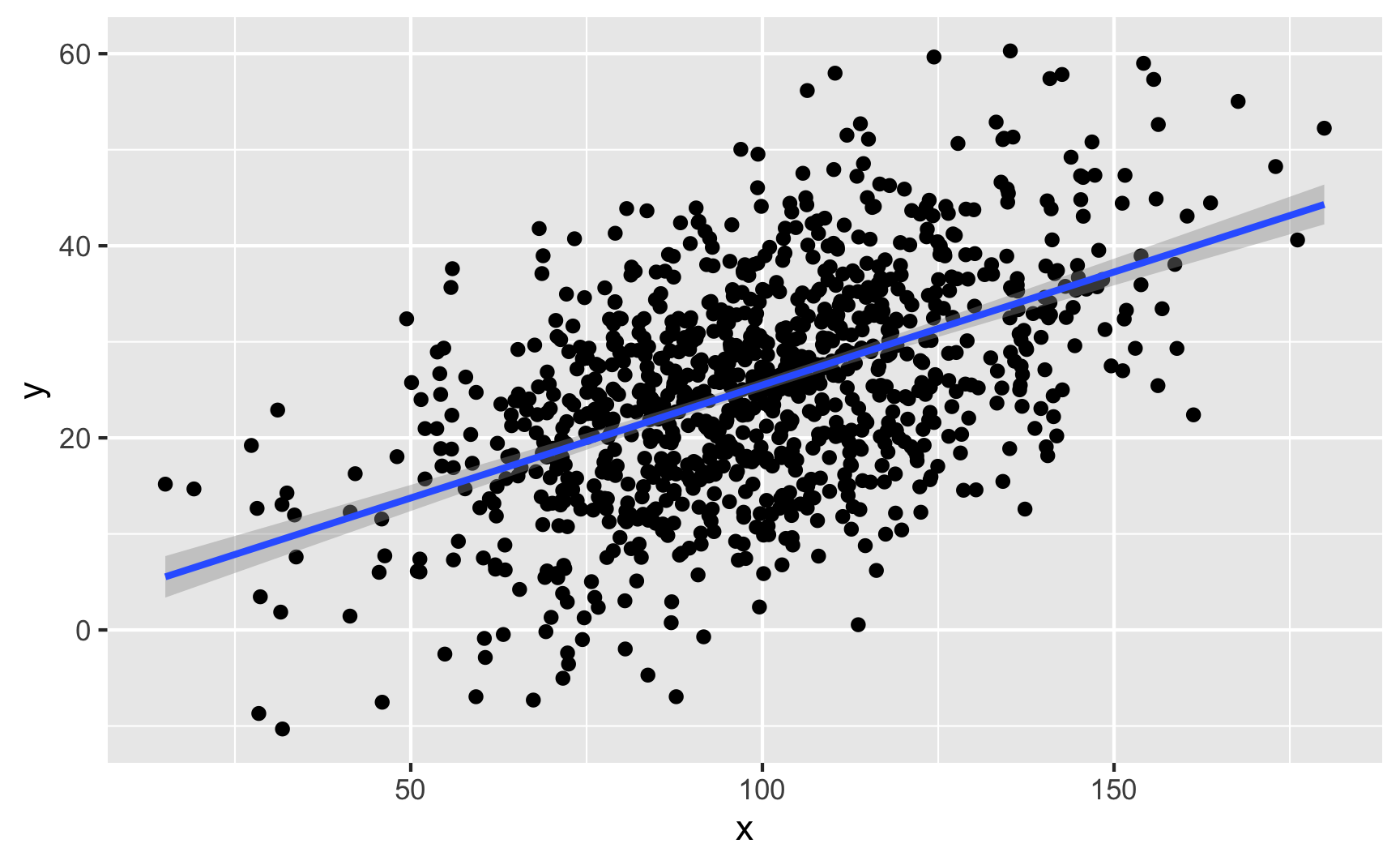
We can confirm the effect with a model:
lm(y ~ x, data = temp_data) |>
  tidy()
## # A tibble: 2 × 5
##   term        estimate std.error statistic  p.value
##   <chr>          <dbl>     <dbl>     <dbl>    <dbl>
## 1 (Intercept)    1.98     1.28        1.54 1.24e- 1
## 2 x 0.235 0.0125 18.8 1.49e-67If you have one binary column and one continuous/numeric column, it’s generally best to not use a scatterplot. Instead, either look at the distribution of the continuous variable across the binary variable with a faceted histogram or overlaid density plot, or look at the average of the continuous variable across the different values of the binary variable with a point range.
Let’s make two columns: a continuous outcome (y) and a binary treatment (x). Being in the treatment group causes an increase of 20 points, on average.
set.seed(1234)

temp_data <- tibble(
  treatment = rbinom(1000, size = 1, prob = 0.5)  # Make 1000 0/1 values with 50% chance of each
) |>
  mutate(outcome = rbeta(1000, shape1 = 3, shape2 = 16) +  # Baseline distribution
           (20 * treatment) +  # Effect of treatment
           rnorm(1000, mean = 0, sd = 20)) |>   # Add some noise
  mutate(treatment = factor(treatment))  # Make treatment a factor/categorical variable
We can check the numbers with a model:
lm(outcome ~ treatment, data = temp_data) |> tidy()
## # A tibble: 2 × 5
##   term        estimate std.error statistic  p.value
##   <chr>          <dbl>     <dbl>     <dbl>    <dbl>
## 1 (Intercept)    0.244     0.935     0.261 7.94e- 1
## 2 treatment1    20.9       1.30     16.1   4.70e-52
Here’s what that looks like as a histogram:
ggplot(temp_data, aes(x = outcome, fill = treatment)) +
  geom_histogram(binwidth = 5, color = "white", boundary = 0) +
  guides(fill = "none") +  # Turn off the fill legend since it's redundant
  facet_wrap(vars(treatment), ncol = 1)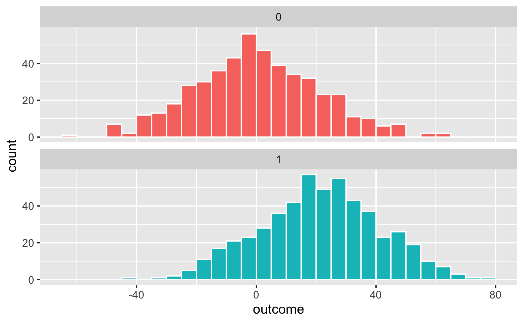
And as overlapping densities:
ggplot(temp_data, aes(x = outcome, fill = treatment)) +
  geom_density(alpha = 0.5)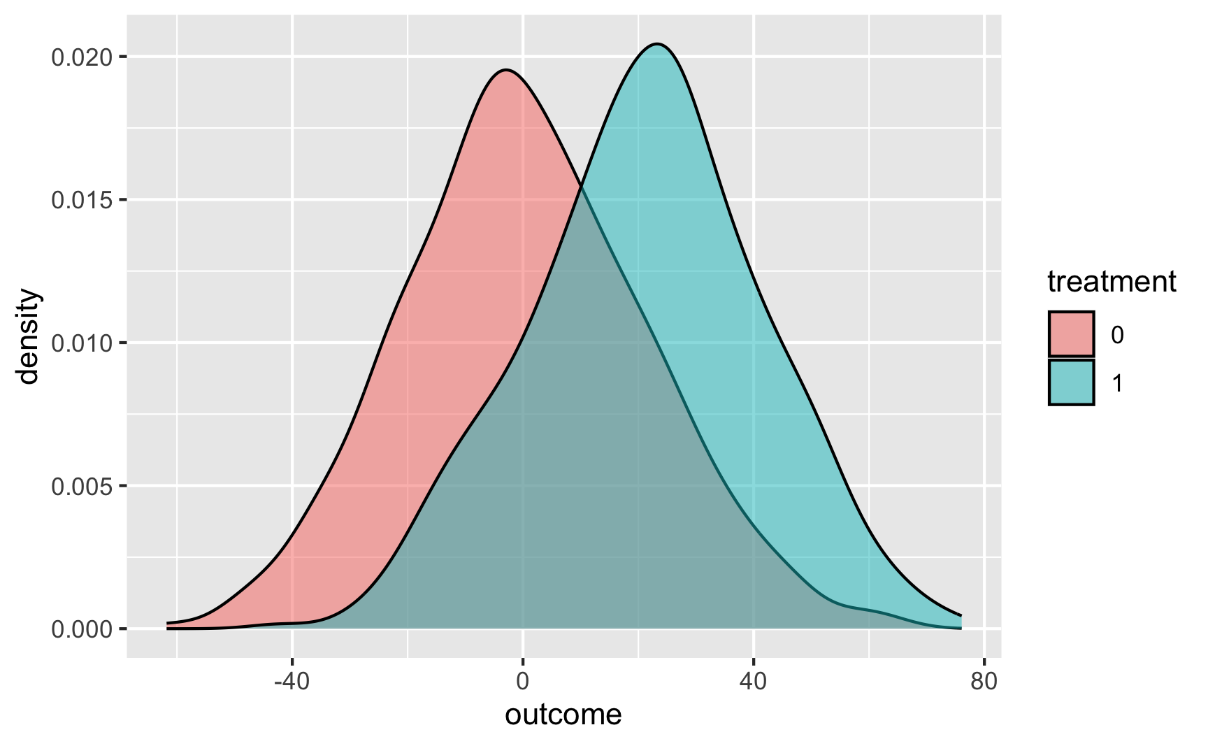
And with a point range:
# hahaha these error bars are tiny
ggplot(temp_data, aes(x = treatment, y = outcome, color = treatment)) +
  stat_summary(geom = "pointrange", fun.data = "mean_se") +
  guides(color = "none")  # Turn off the color legend since it's redundant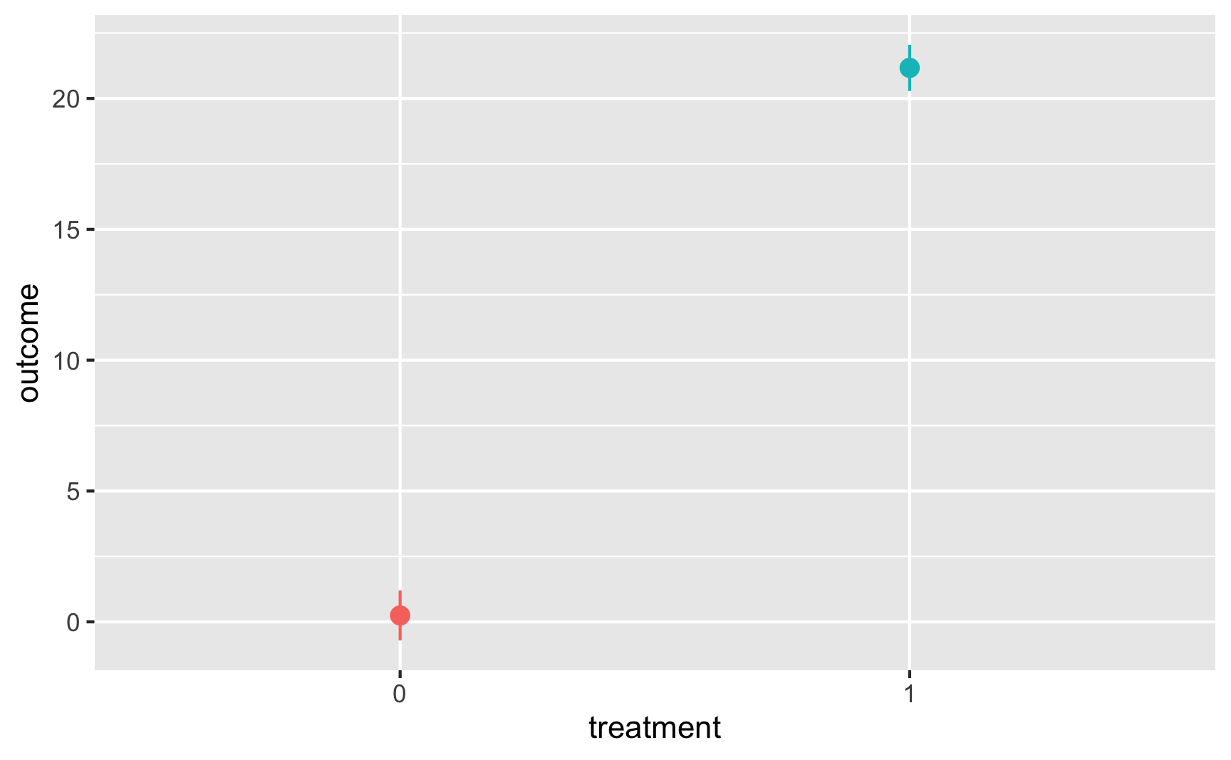
Those previous sections go into a lot of detail. In general, here’s the process you should follow when building relationships in synthetic data:
Here’s a shorter guide for creating a complete observational DAG for use with adjustment-based approaches like inverse probability weighting or matching:
Generating data for a full complete observational DAG like the example above is complicated and hard. These other forms of causal inference are circumstantial (i.e. tied to specific contexts like before/after treatment/control or arbitrary cutoffs) instead of adjustment-based, so they’re actually a lot easier to simulate! So don’t be scared away yet!
Here are shorter guides for specific approaches:
There are several R packages that let you generate synthetic data with built-in relationships in a more automatic way. They all work a little differently, and if you’re interested in trying them out, make sure you check the documentation for details.
The {fabricatr} package is a very powerful package for simulating data. It was invented specifically for using in preregistered studies, so it can handle a ton of different data structures like panel data and time series data. You can build in causal effects and force columns to be correlated with each other.
{fabricatr} has exceptionally well-written documentation with like a billion detailed examples (see the right sidebar here). This is a gold standard package and you should most definitely check it out.
Here’s a simple example of simulating a bunch of voters and making older ones more likely to vote:
library(fabricatr)

set.seed(1234)

fake_voters <- fabricate(
  # Make 100 people
  N = 100,
  # Age uniformly distributed between 18 and 85
  age = round(runif(N, 18, 85)),
  # Older people more likely to vote
  turnout = draw_binary(prob = ifelse(age < 40, 0.4, 0.7), N = N)
)

head(fake_voters)
##    ID age turnout
## 1 001  26       0
## 2 002  60       1
## 3 003  59       1
## 4 004  60       1
## 5 005  76       1
## 6 006  61       1
And here’s an example of country-year panel data where there are country-specific and year-specific effects on GDP:
set.seed(1234)

panel_global_data <- fabricate(
  years = add_level(
    N = 10,
    ts_year = 0:9,
    year_shock = rnorm(N, 0, 0.3)
  ),
  countries = add_level(
    N = 5,
    base_gdp = runif(N, 15, 22),
    growth_units = runif(N, 0.25, 0.5),
    growth_error = runif(N, 0.15, 0.5),
    nest = FALSE
  ),
  country_years = cross_levels(
    by = join_using(years, countries),
    gdp_measure = base_gdp + year_shock + (ts_year * growth_units) +
      rnorm(N, sd = growth_error)
  )
) |>
  # Scale up the years to be actual years instead of 1, 2, 3, etc.
  mutate(year = ts_year + 2010)

head(panel_global_data)
##   years ts_year year_shock countries base_gdp growth_units growth_error country_years gdp_measure year
## 1    01       0   -0.36212         1    17.22       0.4526       0.3096            01       17.07 2010
## 2    02       1    0.08323         1    17.22       0.4526       0.3096            02       17.55 2011
## 3    03       2    0.32533         1    17.22       0.4526       0.3096            03       18.72 2012
## 4    04       3   -0.70371         1    17.22       0.4526       0.3096            04       17.99 2013
## 5    05       4    0.12874         1    17.22       0.4526       0.3096            05       19.25 2014
## 6 06 5 0.15182 1 17.22 0.4526 0.3096 06 19.63 2015ggplot(panel_global_data, aes(x = year, y = gdp_measure, color = countries)) +
geom_line() +
labs(x = "Year", y = "Log GDP", color = "Countries")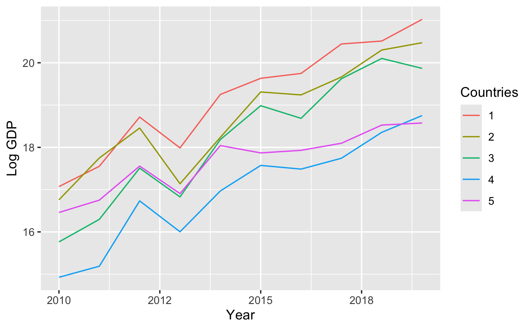
That all just scratches the surface of what {fabricatr} can do. Again, check the examples and documentation and play around with it to see what else it can do.
The {wakefield} package is jokingly named after Andrew Wakefield, the British researcher who invented fake data to show that the MMR vaccine causes autism. This package lets you quickly generate random fake datasets. It has a bunch of pre-set column possibilities, like age, color, Likert scales, political parties, religion, and so on, and you can also use standard R functions like rnorm(), rbinom(), or rbeta(). It also lets you create repeated measures (1st grade score, 2nd grade score, 3rd grade score, etc.) and build correlations between variables.
You should definitely look at the documentation to see a ton of examples of how it all works. Here’s a basic example:
library(wakefield)

set.seed(1234)

wakefield_data <- r_data_frame(
  n = 500,
  id,
  treatment = rbinom(1, 0.3),  # 30% chance of being in treatment
  outcome = rnorm(mean = 500, sd = 100),
  race,
  age = age(x = 18:45),
  sex = sex_inclusive(),
  survey_question_1 = likert(),
  survey_question_2 = likert()
)
head(wakefield_data)
## # A tibble: 6 × 8
##   ID    treatment outcome Race       age sex      survey_question_1 survey_question_2
##   <chr>     <int>   <dbl> <fct>    <int> <fct>    <ord>             <ord>
## 1 001           0    544. White       35 Intersex Disagree          Agree
## 2 002           0    606. White       38 Male     Disagree          Strongly Disagree
## 3 003           0    545. White       38 Female   Neutral           Strongly Agree
## 4 004           0    566. Black       45 Female   Strongly Agree    Disagree
## 5 005           1    386. Black       41 Male     Disagree          Agree
## 6 006 0 463. Hispanic 20 Female Disagree AgreeThe {faux} package does some really neat things. We can create data that has built-in correlations without going through all the math. For instance, let’s say we have 3 variables A, B, and C that are normally distributed with these parameters:
We want A to correlate with B at r = 0.8 (highly correlated), A to correlate with C at r = 0.3 (less correlated), and B to correlate with C at r = 0.4 (moderately correlated). Here’s how to create that data with {faux}:
library(faux)

set.seed(1234)

faux_data <- rnorm_multi(n = 100,
                         mu = c(10, 5, 20),
                         sd = c(2, 1, 5),
                         r = c(0.8, 0.3, 0.4),
                         varnames = c("A", "B", "C"),
                         empirical = FALSE)
head(faux_data)
##        A     B     C
## 1 11.742 5.612 25.89
## 2  9.060 4.177 18.79
## 3  9.373 4.466 14.57
## 4 10.913 5.341 31.88
## 5  8.221 4.039 18.14
## 6 10.095 4.517 17.43

# Check averages and standard deviations
faux_data |>
  # Convert to long/tidy so we can group and summarize
  pivot_longer(cols = everything(), names_to = "variable", values_to = "value") |>
  group_by(variable) |>
  summarize(mean = mean(value),
            sd = sd(value))
## # A tibble: 3 × 3
##   variable  mean    sd
##   <chr>    <dbl> <dbl>
## 1 A        10.2   2.08
## 2 B         5.02  1.00
## 3 C        20.8   5.01

# Check correlations
cor(faux_data$A, faux_data$B)
## [1] 0.808
cor(faux_data$A, faux_data$C)
## [1] 0.301
cor(faux_data$B, faux_data$C)
## [1] 0.4598
{faux} can do a ton of other things too, so make sure you check out the documentation and all the articles with examples here.