Code
library(tidyverse)
library(broom)
library(scales)
library(ggdag)library(tidyverse)
library(broom)
library(scales)
library(ggdag)Draw a DAG that maps out how all the columns you care about are related.
Difference-in-differences approaches to causal inference are not based on models but on circumstances or context or research design. You need comparable treatment and control groups before and after some policy or program is implemented.
We’ll keep with our mosquito net example and pretend that two cities in some country are dealing with malaria infections. City B rolls out a free net program in 2017; City A does not. Here’s what the DAG looks like:
did_dag <- dagify(
  mal ~ net + year + city,
  net ~ year + city,
  coords = list(
    x = c(mal = 3, net = 1, year = 2, city = 2),
    y = c(mal = 2, net = 2, year = 3, city = 1)
  )
)

ggdag(did_dag) +
  theme_dag()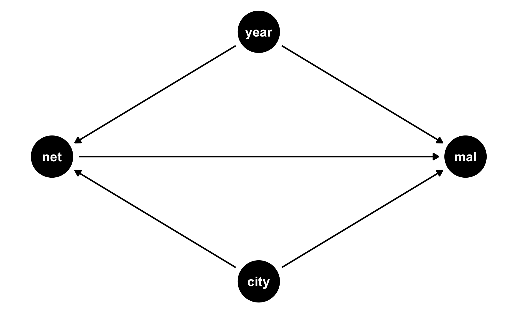
Specify how those nodes are measured.
Here’s how we’ll measure these nodes:
Malaria risk: scale from 0–100, mostly around 60, but ranging from 30ish to 90ish. Best to use a Beta distribution.
Net use: binary 0/1, TRUE/FALSE variable. This is technically binomial, but we don’t need to simulate it since it will only happen for people who are in the treatment city after the universal net rollout.
Year: year ranging from 2013 to 2020. Best to use a uniform distribution.
City: binary 0/1, City A/City B variable. Best to use a binomial distribution.
Specify the relationships between the nodes based on the DAG equations.
There are two models in the DAG:
net ~ year + city: Net use is determined by being in City B and being after 2017. We’ll assume perfect compliance here (but it’s fairly easy to simulate non-compliance and have some people in City A use nets after 2017, and some people in both cities use nets before 2017).
mal ~ net + year + city: Malaria risk is determined by net use, year, and city. It’s determined by lots of other things too (like we saw in the previous DAGs), but since we’re assuming that the two cities are comparable treatment and control groups, we don’t need to worry about things like health, income, age, etc.
We’ll pretend that in general, City B has historicallly had a problem with malaria and people there have had higher risk: being in City B increases malaria risk by 5 points, on average. Over time, both cities have worked on mosquito abatement, so average malaria risk has decreased by 2 points per year (in both cities, because we believe in parallel trends). Using a mosquito net causes a decrease of 10 points on average. That’s our causal effect.
Generate random columns that stand alone. Generate related columns using regression math. Consider adding random noise. This is an entirely trial and error process until you get numbers that look good. Rely heavily on plots as you try different coefficients and parameters. Optionally rescale any columns that go out of reasonable bounds. If you rescale, you’ll need to tinker with the coefficients you used since the final effects will also get rescaled.
Generation time! Heavily annotated code below:
# Make this randomness consistent
set.seed(1234)

# Simulate 2567 people (just for fun)
n_people <- 2567

did_data <- tibble(
  # Make an ID column (not necessary, but nice to have)
  id = 1:n_people,
  # Generate year variable: uniform, between 2013 and 2020. Round so it's whole.
  year = round(runif(n_people, min = 2013, max = 2020), 0),
  # Generate city variable: binomial, 50% chance of being in a city. We'll use
  # sample() instead of rbinom()
  city = sample(c("City A", "City B"), n_people, replace = TRUE)
) |>
  # Generate net variable. We're assuming perfect compliance, so this will only
  # be TRUE for people in City B after 2017
  mutate(net = ifelse(city == "City B" & year > 2017, TRUE, FALSE)) |>
  # Generate a malaria risk variable based on year, city, net use, and random noise
  mutate(
    malaria_risk_base = rbeta(n_people, shape1 = 6, shape2 = 3) * 100,
    # Risk goes up if you're in City B because they have a worse problem.
    # We could just say "city_effect = 5" and give everyone in City A an
    # exact 5-point boost, but to add some noise, we'll give people an
    # average boost using rnorm(). Some people might go up 7, some might go
    # up 1, some might go down 2
    city_effect = ifelse(
      city == "City B",
      rnorm(n_people, mean = 5, sd = 2),
      0
    ),
    # Risk goes down by 2 points on average every year. Creating this
    # effect with regression would work fine (-2 * year), except the years
    # are huge here (-2 * 2013 and -2 * 2020, etc.) So first we create a
    # smaller year column where 2013 is year 1, 2014 is year 2, and so on,
    # that way we can say -2 * 1 and -2 * 6, or whatever.
    # Also, rather than make risk go down by *exactly* 2 every year, we'll
    # add some noise with rnorm(), so for some people it'll go down by 1 or
    # 4 or up by 1, and so on
    year_smaller = year - 2012,
    year_effect = rnorm(n_people, mean = -2, sd = 0.1) * year_smaller,
    # Using a net causes a decrease of 10 points, on average. Again, rather
    # than use exactly 10, we'll use a distribution around 10. People only
    # get a net boost if they're in City B after 2017.
    net_effect = ifelse(
      city == "City B" & year > 2017,
      rnorm(n_people, mean = -10, sd = 1.5),
      0
    ),
    # Finally combine all these effects to create the malaria risk variable
    malaria_risk = malaria_risk_base + city_effect + year_effect + net_effect,
    # Rescale so it doesn't go below 0 or above 100
    malaria_risk = rescale(malaria_risk, to = c(0, 100))
  ) |>
  # Make an indicator variable showing if the row is after 2017
  mutate(after = year > 2017)

head(did_data)
## # A tibble: 6 × 11
##      id  year city   net   malaria_risk_base city_effect year_smaller year_effect net_effect malaria_risk after
##   <int> <dbl> <chr>  <lgl>             <dbl>       <dbl>        <dbl>       <dbl>      <dbl>        <dbl> <lgl>
## 1     1  2014 City B FALSE              53.0        6.25            2       -3.97          0         54.2 FALSE
## 2     2  2017 City B FALSE              89.7        3.32            5       -9.17          0         84.1 FALSE
## 3     3  2017 City A FALSE              49.5        0               5      -10.1           0         37.6 FALSE
## 4     4  2017 City B FALSE              37.4        7.11            5       -9.44          0         33.1 FALSE
## 5     5  2019 City A FALSE              76.6        0               7      -14.7           0         61.1 TRUE
## 6     6  2017 City B FALSE              65.7        5.38            5      -10.4           0         59.9 FALSE
Verify all relationships with plots and models.
Is risk higher in City B? Yep.
ggplot(did_data, aes(x = city, y = malaria_risk, color = city)) +
  stat_summary(geom = "pointrange", fun.data = "mean_se") +
  guides(color = "none")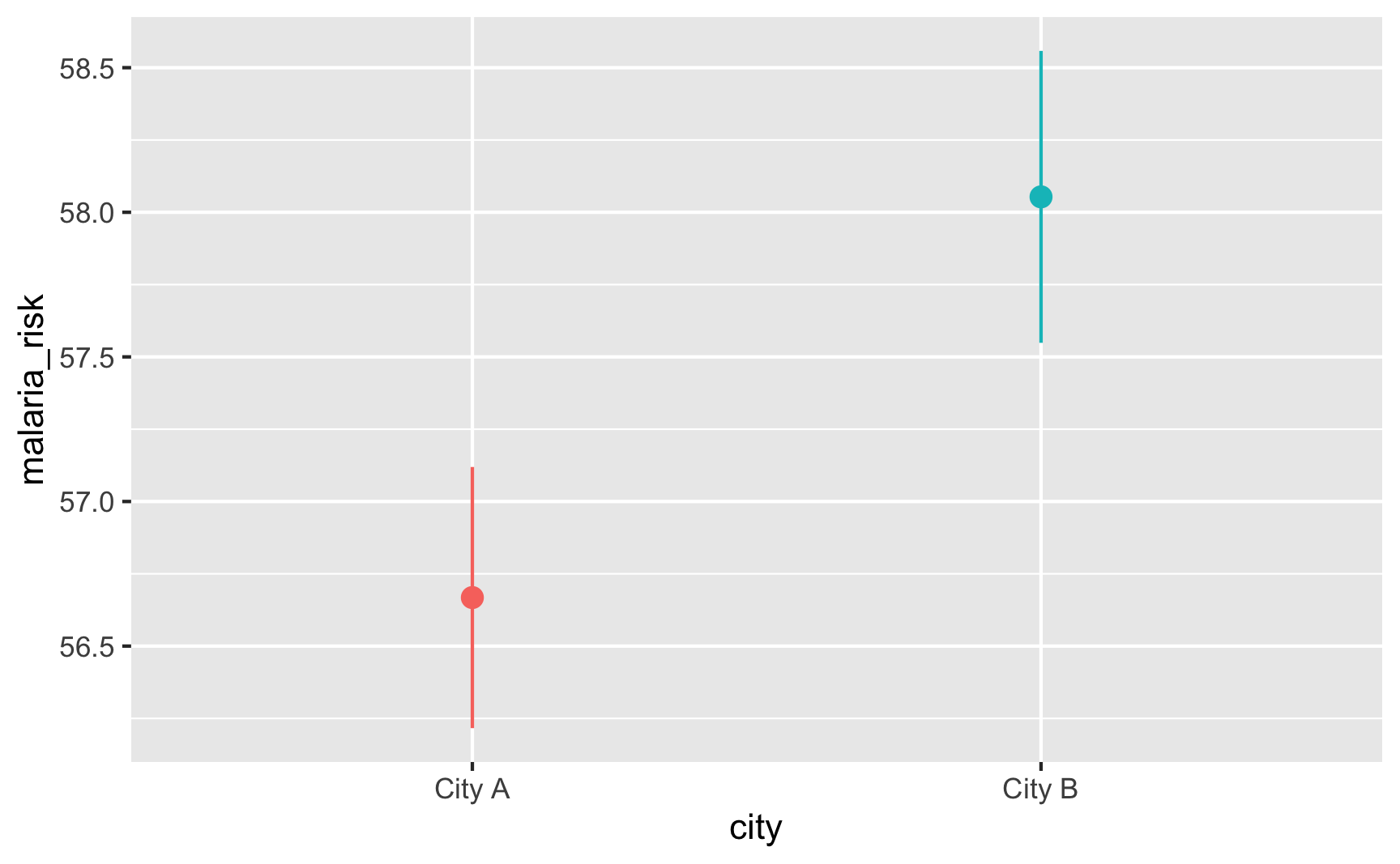
Does risk decrease over time? And are the trends parallel? There was a weird random spike in City B in 2017 for whatever reason, but in general, the trends in the two cities are pretty parallel from 2013 to 2017.
plot_data <- did_data |>
  group_by(year, city) |>
  summarize(mean_risk = mean(malaria_risk),
            se_risk = sd(malaria_risk) / sqrt(n()),
            upper = mean_risk + (1.96 * se_risk),
            lower = mean_risk + (-1.96 * se_risk))

ggplot(plot_data, aes(x = year, y = mean_risk, color = city)) +
  geom_vline(xintercept = 2017.5) +
  geom_ribbon(aes(ymin = lower, ymax = upper, fill = city), alpha = 0.3, color = FALSE) +
  geom_line() +
  theme(legend.position = "bottom")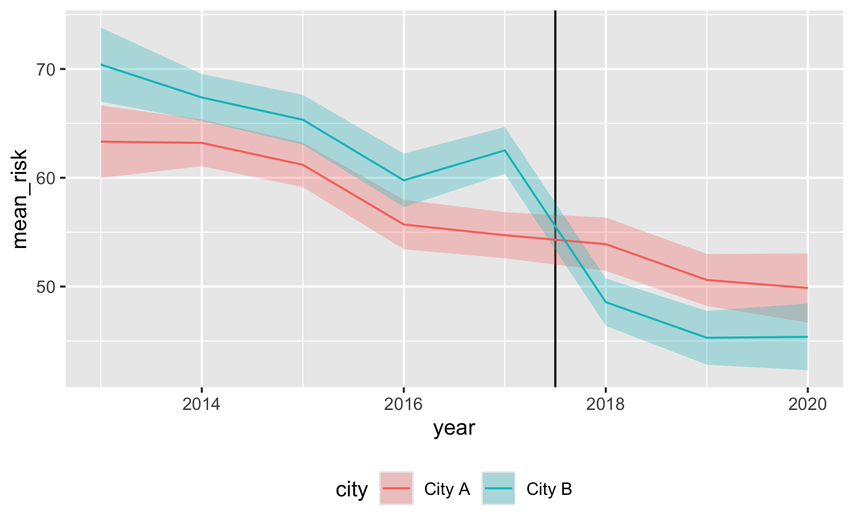
Try it out!
Let’s see if it works! For diff-in-diff we need to use this model:
\[ \text{Malaria risk} = \alpha + \beta\ \text{City B} + \gamma\ \text{After 2017} + \delta\ (\text{City B} \times \text{After 2017}) + \varepsilon \]
model_did <- lm(malaria_risk ~ city + after + city * after, data = did_data)
tidy(model_did)
## # A tibble: 4 × 5
##   term                 estimate std.error statistic  p.value
##   <chr>                   <dbl>     <dbl>     <dbl>    <dbl>
## 1 (Intercept)             59.2      0.549    108.   0
## 2 cityCity B               5.17     0.778      6.64 3.71e-11
## 3 afterTRUE               -7.47     0.939     -7.96 2.61e-15
## 4 cityCity B:afterTRUE   -10.2      1.32      -7.79 9.67e-15
It works! Being in City B is associated with a 5-point higher risk on average; being after 2017 is associated with a 7.5-point lower risk on average, and being in City B after 2017 causes risk to drop by −10. The number isn’t exactly −10 here, since we rescaled the malaria_risk column a little, but still, it’s close. It’d probably be a good idea to build in some more noise and noncompliance, since the p-values are really really tiny here, but this is good enough for now.
Here’s an obligatory diff-in-diff visualization:
plot_data <- did_data |>
  group_by(after, city) |>
  summarize(
    mean_risk = mean(malaria_risk),
    se_risk = sd(malaria_risk) / sqrt(n()),
    upper = mean_risk + (1.96 * se_risk),
    lower = mean_risk + (-1.96 * se_risk)
  )

# Extract parts of the model results for adding annotations
model_results <- tidy(model_did)
before_treatment <- filter(model_results, term == "(Intercept)")$estimate +
  filter(model_results, term == "cityCity B")$estimate
diff_diff <- filter(model_results, term == "cityCity B:afterTRUE")$estimate
after_treatment <- before_treatment +
  diff_diff +
  filter(model_results, term == "afterTRUE")$estimate

ggplot(plot_data, aes(x = after, y = mean_risk, color = city, group = city)) +
  geom_pointrange(aes(ymin = lower, ymax = upper)) +
  geom_line() +
  annotate(
    geom = "segment",
    x = FALSE,
    xend = TRUE,
    y = before_treatment,
    yend = after_treatment - diff_diff,
    linetype = "dashed",
    color = "grey50"
  ) +
  annotate(
    geom = "segment",
    x = 2.1,
    xend = 2.1,
    y = after_treatment,
    yend = after_treatment - diff_diff,
    linetype = "dotted",
    color = "blue"
  ) +
  theme(legend.position = "bottom")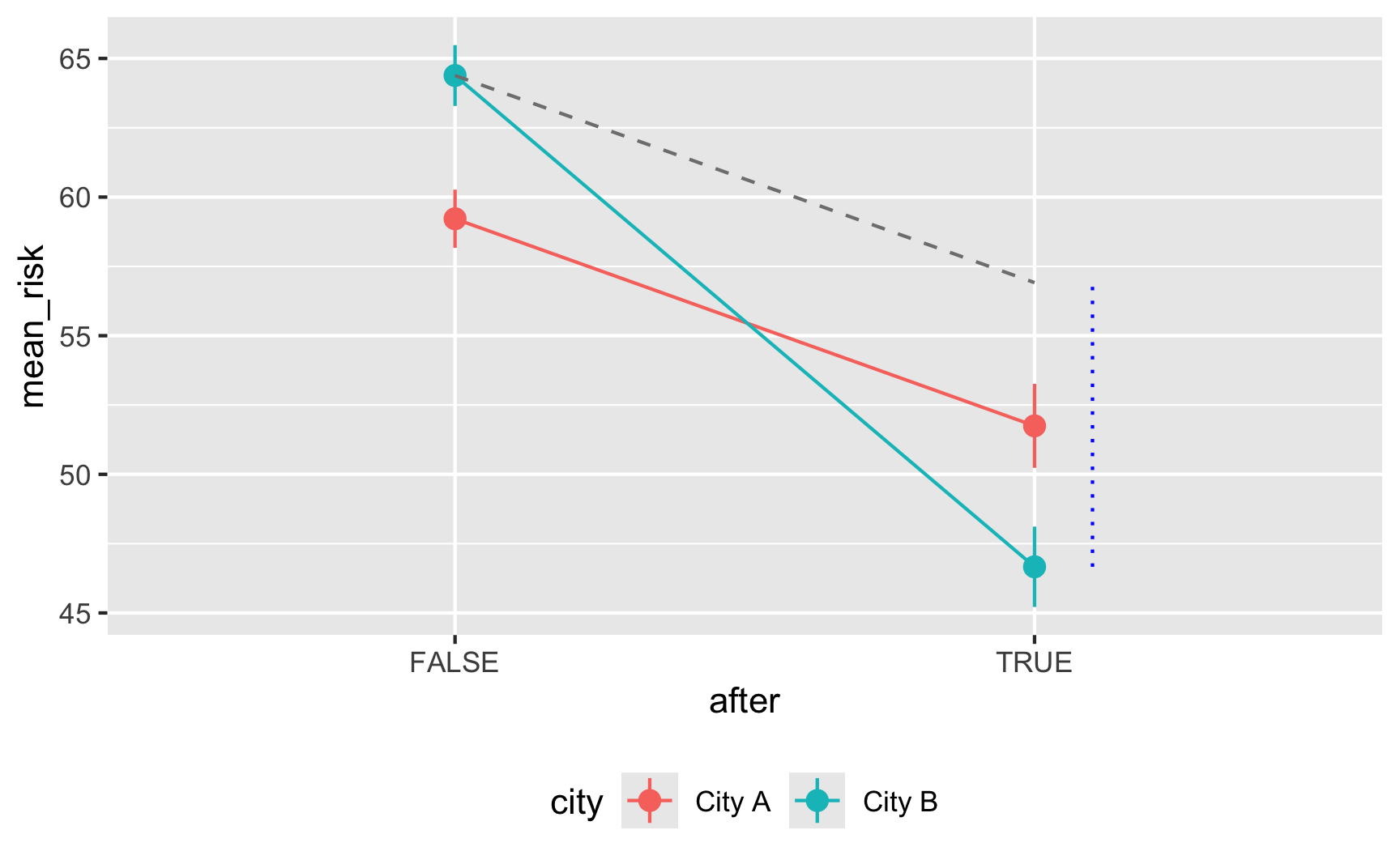
Save the data.
The data works, so let’s get rid of the intermediate columns we don’t need and save it as a CSV file.
did_data_final <- did_data |>
  select(id, year, city, net, malaria_risk)
head(did_data_final)
## # A tibble: 6 × 5
##      id  year city   net   malaria_risk
##   <int> <dbl> <chr>  <lgl>        <dbl>
## 1     1  2014 City B FALSE         54.2
## 2     2  2017 City B FALSE         84.1
## 3     3  2017 City A FALSE         37.6
## 4     4  2017 City B FALSE         33.1
## 5     5  2019 City A FALSE         61.1
## 6 6 2017 City B FALSE 59.9# Save data
write_csv(did_data_final, "data/diff_diff.csv")